I’ve been working on a lot of good schtuff lately on the area of capacity planning. And I’ve greatly improved my time to generate workload characterization visualization and analysis using my AWR scripts which I enhanced to fit on the analytics tool that I’ve been using.. and that is Tableau.
So I’ve got a couple of performance and capacity planning use case scenarios which I will blog in parts in the next few days or weeks. But before that I need to familiarize you on how I mine this valuable AWR performance data.
Let’s get started with the AWR top events, the same top events that you see in your AWR reports but presented in a time series manner across SNAP_IDs…
So I’ve got this script called awr_topevents_v2.sql http://goo.gl/TufUj which I added a section to compute for “CPU wait” (new metric in 11g) to include the “unaccounted for DB Time” on high run queue or CPU intensive workloads. This is a newer version of the script that I used here http://karlarao.wordpress.com/2010/07/25/graphing-the-aas-with-perfsheet-a-la-enterprise-manager/
On the screenshots below I spooled the output on a text file and transformed it to a CSV format. Then from there you can play around with the data points using Tableau that you can download here http://www.tableausoftware.com/public/download
Is this a free software? Yes. But the catch is Tableau Public only allows you to have 100K rows on a given text or csv file. But for my capacity planning and troubleshooting purposes that’s enough to do the work ![]() The paid version of Tableau (Desktop) allows you to connect directly to the database but that will cost you $1999. ouch. The Tableau (Desktop Personal) is much like the Public version but with no data limit and it allows you to save your work on a specific file format (.twb and .tde files), Yes guys in Public version you are only allowed to save it to their Public portal… but that’s fine as long as I have the data points I can quickly work on the visualization again. Here’s the comparison if you are interested on the detailed product comparison http://www.tableausoftware.com/products/desktop/specs
The paid version of Tableau (Desktop) allows you to connect directly to the database but that will cost you $1999. ouch. The Tableau (Desktop Personal) is much like the Public version but with no data limit and it allows you to save your work on a specific file format (.twb and .tde files), Yes guys in Public version you are only allowed to save it to their Public portal… but that’s fine as long as I have the data points I can quickly work on the visualization again. Here’s the comparison if you are interested on the detailed product comparison http://www.tableausoftware.com/products/desktop/specs
Once you get the CSV file ready which you can download HERE
1) This is a trial version of Tableau Desktop.. the steps should be the same or similar with the Public version. Click “Connect to data”

2) Select the CSV file

3) Select “Text File”

4) Then you can view the data points

5) Data Points are shown below

6) Click OK

7) Import all data

8) It will create a file format that I believe where it stores the dimension data

9) After the data points import

10) Drag the “Events” on the color section, then “Add all members”

11) Click OK

12) Drag the AAS on the Rows

13) SNAP_ID on the columns. That’s your AWR SNAP_IDs

14) Filter the negative values. Those are the periods where you had instance shutdown.

15) Exclude the Nulls

16) And now you can select an area! hover on it and it will give you the event and the AAS number (the higher the AAS the more database work is happening)

17) Play around with the AAS data points

18) Now here it will show you detailed SNAP_ID data points (the dots) and you can hover on it
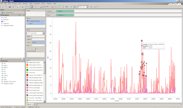
19) You can also view the underlying data points of those dots

20) Here it shows the event, SNAP_IDs, and the AAS value.. so here you can grab the SNAP_ID and execute the AWRRPT.sql on the database server to generate the larger AWR report

21) Drilling down more on the data points

22) You can also focus just on specific events. Let’s say just the CPU..

23) or the event that’s hogging most of the resources

24) and just select the data points from that bottleneck

25) Copy the summary info

26) Then play around with the data in command line


11/07/06 03:30 – 11/07/07 12:00SNAP_ID 34417 – 34516
11/07/10 13:30 – 11/07/12 15:00SNAP_ID 34565 – 34694
11/07/13 15:30 – 11/07/16 08:00SNAP_ID 35213 – 35322
11/07/27 03:30 – 11/07/29 10:00
SNAP_ID 35363 – 35477
11/07/30 06:30 – 11/08/01 15:30
SNAP_ID 35590 – 35670
11/08/04 00:00 – 11/08/05 16:00

Hope I’ve shared you some good stuff!

