On this previous blog post I was able to take advantage of the AWR repository particularly the DBA_HIST tables to have a far better workload information and nice correlation of the Database Server’s Capacity, Requirements, and Utilization on a single output… and yes… easily going through all the SNAP_IDs!
Having this info made it easier for me to notice trends (text or visualization) and play around with the data (some statistics out of it)… which I can say a big help on finding the root cause of the problem (here and here)
Before going any further… I recommend you read first Kyle Hailey’s slide about AAS (Average Active Sessions).
For me, AAS has become my default (golden) metric on finding the periods where the database could be having a bottleneck or just idle.. yes, the slide I mentioned above was right on this.. AAS could be your “stethoscope” but it doesn’t stop there. For it to be more useful you must be aware about the components of AAS (much like drilling down on the time components) and have this kind of data over a period of time (across SNAP_IDs). Well Enterprise Manager does this nice graphs and slicing the AAS components to different wait classes and it’s got a “historical” view which you could go back and drill down on the past load activity.
What could be the problem?
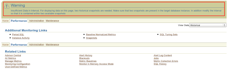
I know some of you have encountered this at some point.. you are configured with a long AWR retention period (365 days to exaggerate it) but Enterprise Manager won’t let you go back farther.. all because there was an instance shutdown between the date you want to go and the date you are now. Or could be some other issue where Enterprise Manager really can’t just give you the visualization you need.
So what could be the alternative?
1) Use the Top Timed Events SQL (awr_topevents.sql) listed on the Scripts Section and focus on the AAS and wait class columns across SNAP_IDs
2) Or use the script together with Perfsheet! … a great tool for ad-hoc performance visualization (see some examples here, here, here, here)
IMPORTANT NOTE: Diagnostic Pack License is needed for the scripts
Now time for Perfsheet a la Enterprise Manager!
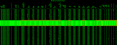
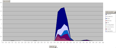
We will focus on the sudden spike that happened around 6:20 to 7:01 AM (SNAP_ID 335-339) as shown on this previous blog post or you could just check the highlighted black & green output below where the AAS is on the range of 2.2 to 3.5 (SNAP_ID 335-339) then on the right side of it is a stacked area chart of the awr_topevents.sql using Perfsheet. It’s clear from the image that there’s a big spike on the database load… but we want to know more about it by drilling down on the AAS components.
| awr_genwl.sql output | Stacked area chart of AAS |
|---|---|
 |
 |
Some more background
On the Enterprise Manager Performance and Top Activity Page you’ll see the AAS components are sliced into different wait classes. But, did you know that their data sources are different?
From the 2nd slide of this presentation AAS (Average Active Sessions) it says that there are two ways to calculate AAS…
1) Time Statistics
2) Sampling…
AAS on the Performance Page uses Time Statistics and is actually from v$system_event + CPU from time model. This is also what the script awr_topevents.sql is doing… it unions the output of v$system_event and the CPU from time model and then filter only the top 5 and do this across the SNAP_IDs but for graphing purposes on the Perfsheet to make it look similar to the Enterprise Manager Performance Page I have to include all of the events so that all the AAS values will be counted. BTW, on 10g below the load chart is coming from v$system_event + v$sysstat “CPU used by this session”.
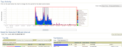
AAS on the Top Activity Page uses Sampling and by default is taking advantage of ASH (samples) and does it on a 15sec refresh rate (you’ll see this proof on the Top Activity Perfsheet graph below)… but as I have observed when you switch from the Real Time 15 sec refresh to Historical then it also starts to behave like the Performance Page (pulls data from v$system_event + CPU from time model).
So what’s the effect? mm… on a high CPU activity period you’ll notice that there will be a higher AAS on the Top Activity Page compared to Performance Page. Simply because ASH samples every second and it does that quickly on every active session (the only way to see CPU usage realtime) while the time model CPU although it updates quicker (5secs I think) than v$sysstat “CPU used by this session” there could still be some lag time and it will still be based on Time Statistics (one of two ways to calculate AAS) which could be affected by averages.
If you want more info about the stuff around the Performance and Top Activity page.. this is worth reading.. History of Session Load
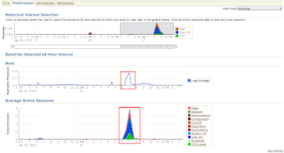
Going back in time – Historical view
| Performance Page – Historical | Top Activity Page – Historical |
|---|---|
 |
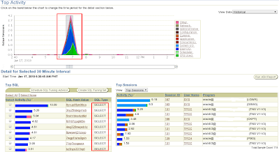 |
Now back to the Perfsheet! Check out the Top Activity Page – Historical above.. I have made a Perfsheet version of that graph which you could see below, on the left is broken down into wait class which really looks the same as the Top Activity Page (above) even their AAS values. While on the right is broken down into wait events.. aside from being more colorful it let’s you see what wait event is consuming the AAS.
| Stacked area chart AAS components – wait class | Stacked area chart AAS components – wait events |
|---|---|
 |
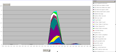 |
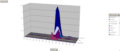
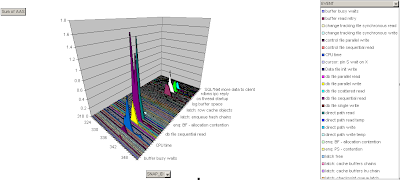
Ooops, don’t get too excited.. important reminder… the 2-dimensional Stacked area chart that Enterprise Manager uses could hide important information and sometimes could be misleading.. and it really helps to have another view and see the data clearly separated into their respective components, rather than being stacked… As you compare the above and below charts, you’ll know what I mean.. Wait Class and Wait Events in 3D area chart view could tell a more meaningful story.
Compare the wait class chart… above notice the blue (Other wait class) on the range of AAS of 1 while below it’s on the range of 0.11 (hidden between CPU and System IO)… that’s a big difference!
Then compare the wait event chart… notice the big difference on the chart? above you can’t really tell what’s happening.. but on 3D you can see that only the db file sequential read and direct path read are on the AAS of 1.6 on SNAP_ID 335 and 336. Yes, you will also not be fooled when you look at the raw data… but visualization is much easier and the way to go but you must be able to sense and validate if it’s driving you to bad conclusions.
BTW, the Perfsheet and the raw data that I used are uploaded here Perfsheet-AAS.zip
| 3D area chart AAS components – wait class | 3D area chart AAS components – wait events |
|---|---|
 |
 |
AAS based on ASH – Real Time
As I have mentioned above, the Top Activity page charts the ASH samples on 15sec refresh rate. You can see below that doing this on Perfsheet will give us the same visualization, yes I’m querying v$active_session_history ![]() and this was also mentioned here
and this was also mentioned here
| Top Activity Page – Real Time | Stacked area chart AAS wait class – Real Time |
|---|---|
 |
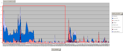 |
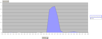
AAS throughout the AWR retention period!

On my test machine I have 365 days retention period.. this enables me to have a data warehouse of performance data. You can see from the chart above (stacked area chart), that what we are focusing on (6:20 to 7:01 AM SNAP_ID 335-339) happens to be the highest load period from all the AAS samples for the lifetime of my test database. You could also see the period of shutdowns (negative value) and other time period where AAS went beyond my maximum CPU which could justify the drill down on the specific SNAP_IDs or time frame… from there you could either use ASH, run the AWR report, run ADDM, or make use of your high caliber scripts!
The good thing here is, you are not guessing!
Hope I’ve shared you some good stuff ![]()

